Dokan and WC vendors Variable Product support compared
In a recent release mail from WC Vendors creator Ben and Jamie, I learnt that they have added variable product support to their plugin. As multi vendor market makers and sharpers ourselves, I felt interested to check out how they have played with this very essential feature of market places.
Why do we need to compare?
Both Dokan and WC vendors are a fan favorite in the multivendor business given that they both have their specialties. So, whenever someone new sets out to create a multivendor marketplace, they need to compare to see which plugin suits them better. Since variable products are new in their system, a lay of the land is needed.
Previously we compared both the plugins as a whole.
Both of these plugins are dependent on WooCommerce and other features are built around the basic features derived from it. Which means, both the plugins use the variable products feature from WooCommerce and manage their way around it.
Basically there is not much feature to add or remove from here. The only game play is to work with user psychology and enhance usability.
So let's compare them two!
Dokan
A fresh user interface designed to improve usability
When you are creating variable products using Dokan, the entire experience is different from WooCommerce backend. This is because Dokan has reinvented their UI and follows that usability pattern all over.
Dokan's variable editor is cleaner, simpler and flexible. This might take WooCommerce users some time to get over, but once they get used to it they won't try anything else. Users are more likely to be convinced that this is definitely an improvement.
Protip → I can actually create an entire product without touching my trackpad or mouse because the product editor is so organized that I can press tab key from my keyboard and jump through the fields very fast like a power user. It was harder in WC Vendors.
Stream lined product creation distracts you less
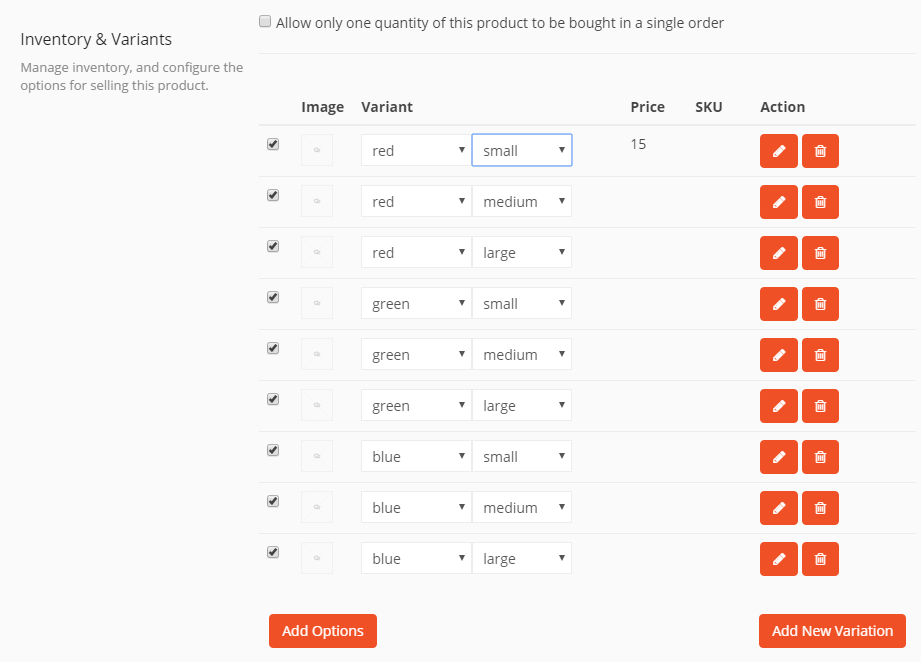
The process of variable product creation is very streamlined in Dokan. The variable menu is just inside every product editor – you just need to tick to enable it. Voila! you can create and customize any number of variations with out going elsewhere.
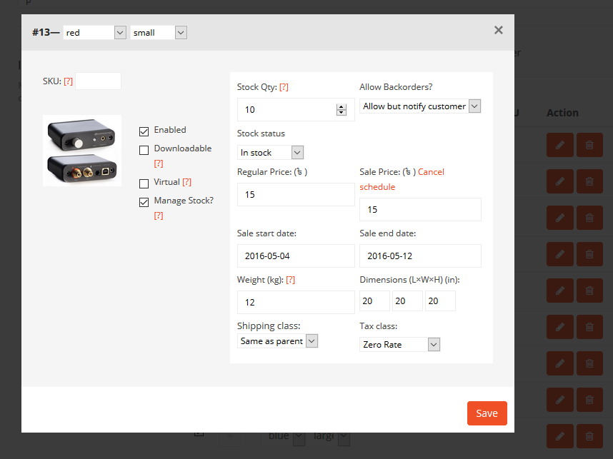
You if want to change anything that you have already made, you don't need to step back. You can just click the Add Options or Add New Variation button or the Edit button brings up modal windows. But in WC Vendors, I had to switch tabs back and forth.
Flat product editor reduces running around
Dokan's product editor UI has gone through an evolution. At first ours were also very much like of WooCommerce, but then we turned to a tabbed view and now we are completely flat view – forever. This is the result of listening to customer feedbacks and research.
The best part of the flat view is everything that you need are in a single page and you do not get lost jumping or scrolling from tab to tab.
You can work quickly without confusion
It is quick because it is already inside the editor, so you can add variations to any existing product anytime without having to take it down. It is simple and easy because the builder is assisted and very much self explanatory.
WC Vendors
Comparatively a basic user interface
WC Vendor's variable feature works in their front end pro dashboard and also in the backend with WooCommerce features. But the most noticeable thing is the frontend output of the feature is not so different than the backend, which might be a similar experience for the WooCommerce users.
I just had expectations to see something new other than a spin up of the WooCommerce backend.
Several steps that might distract you
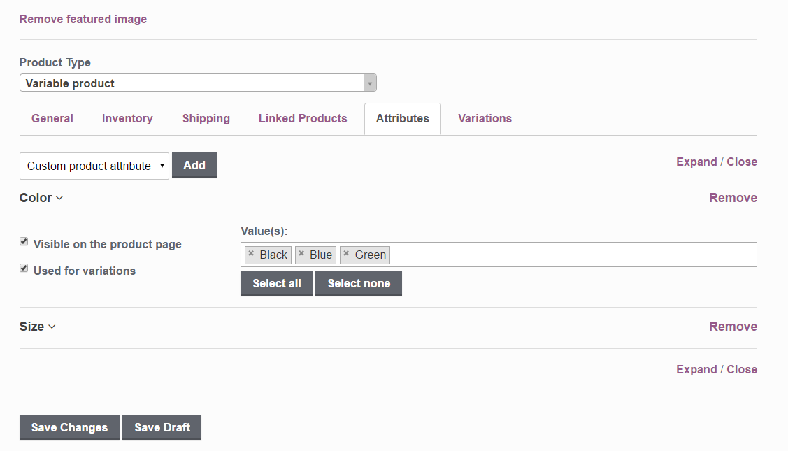
To create a variable product, you have to go back and forth several times between Attributes and Variations tabs and the variations have huge accordion like customization interfaces. It is very easy to get lost while scrolling through the clutter. I created three variations and I even didn't open the other two!
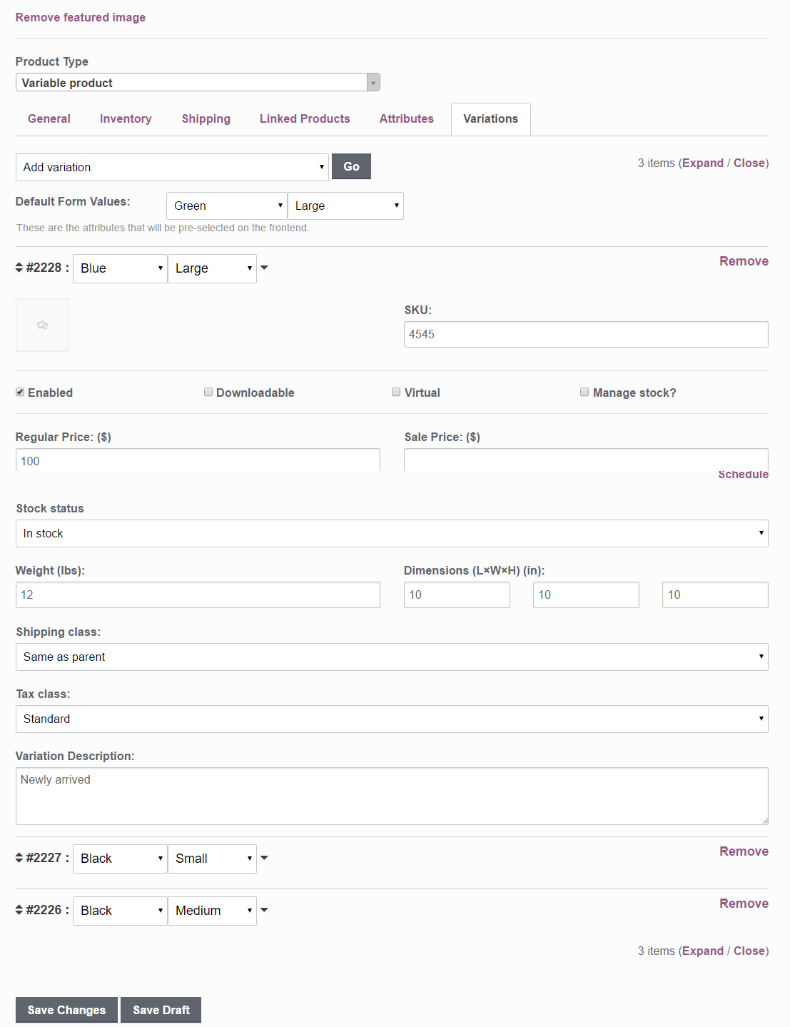
Tabbed product editor takes more time
Tabbed product editors actually cause more trouble than solving a few. It maybe good for basic users, but if you are a busy vendor, need to upload a lot of products regularly, then all this clicking and browsing through menus, drop down selections will make you tiresome. Plus, if you even need to check the previous setting you made, you have to move your mouse and click and then come back again.
But in Dokan, only a scroll up and down is enough.
The workflow is somewhat confusing
There was one mistake I made repeatedly, that is to miss to tick “Used for variations” to enable that attribute. Rather it could have been a turn off button so that ordinary users like me do not need to enable each attribute every time I create. If I just don't want to use an attribute I created, I should be able to turn it off.
When I used it, I wished they had worked more on making things clear and easy.
What do you think?
So, do you think the perspective I have approached is right? In your experience which one did you think has helped you more? Let us know what you feel in comments!
If you need something else compared with another plugin, you can ask me too!


