All You Need In A WooCommerce Product Page To Boost Sales
When you plan to shop online, would you enjoy shopping from it if it has a complicated web store to browse? In many cases, online shops tend to lose some very potential customers for having a very complex e-store product page. Most of the time people browse around for a few minutes in an online shop for their favorite WooCommerce Product, and if they find it difficult to get to their desired product, they tend to lose interest from visiting the site for the second time.
So on occasion to avoid such scenarios of hampering business, there are few things if added to your product page, can hold the interest of the customer to keep them visiting your e-store again and again.
Things To Have In Your WooCommerce Product Page
Easy Product Navigation
While you are on the product page, not being able to navigate the WooCommerce product you want at one go can be a turn-off for most potential customers. So it is essential for any WooCommerce product page to have the option to find the product of your choice easily.
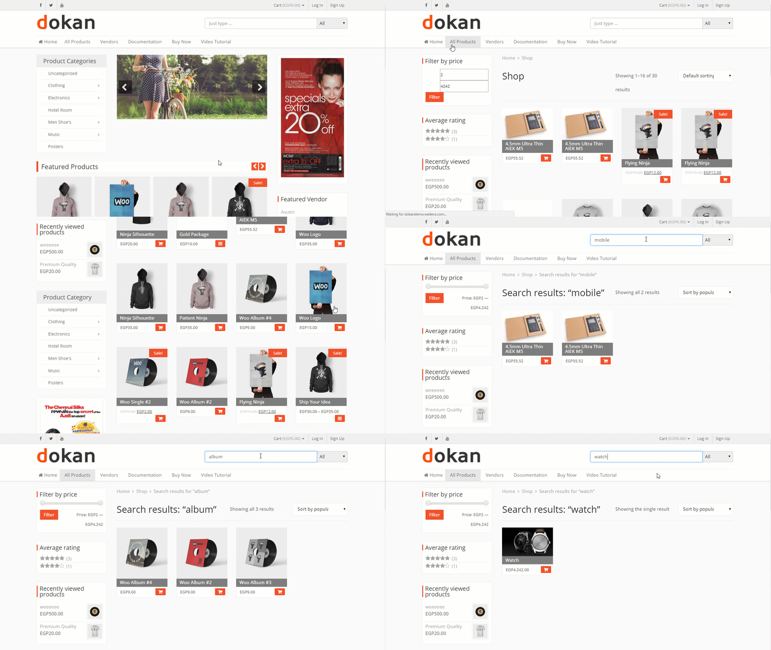
The demonstration above shows how easily the desired product can be navigated through the search bar in a WooCommerce Store.
CTA (Call To Action)
Placement of the CTA (Call to Action) in a WooCommerce product page may play a vital role in helping the customer to place an order quicker. So this highlighted CTA at the right spot in the WooCommerce page may make the page look more user-friendly to the customers for wanting to buy products faster.
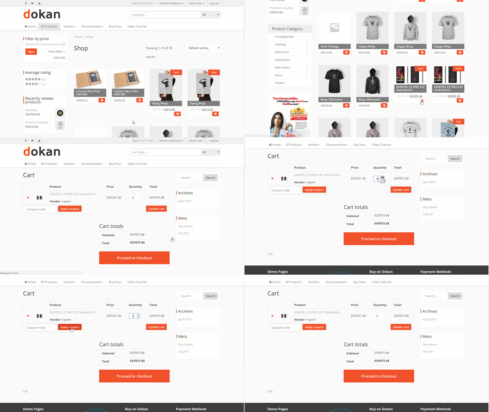
Above you can see the CTA (Call To Action) at the right spot on a product page as well as on the Add To Cart page.
Multiple Payment Option
Coming to shop online but not getting your desired payment option to pay for the carted items can lead them to switch to other available e-stores with the payment options of their demand. So having multiple payment options on the WooCommerce product page should be a regulation practice for every WooCommerce store owner.
This demonstration shows, how you can easily make payment with Stripe after carting a product in a WooCommerce store.
Vendor Store Review
While shopping from a multivendor site, a customer would definitely want to see the store review before buying anything from that vendor. Vendor store review of other customers on the product page would allow the customer to get rid of the trust issues. This keeps the whole process transparent to anyone visiting the product page.
The video above shows, how you can post & display a store review and star-based ratings in a multivendor marketplace to help the customer get an idea about the product and service quality of that particular vendor store.
Live Chat
Who wouldn't like to get an instant reply to any queries about their favorite product in a WooCommerce store? So being able to get the response in real-time through live chat can certainly attract the customer to visit that e-store more often. This enables the customer to ask any question related to their searched product. So live chat is indeed and useful feature to have on the product page of a WooCommerce store.
The video above shows a customer asking a few queries to the vendor about a product he wants to buy.
Various Shipping Options
Suppose a customer liked a product from your WooCommerce store but while checking out he realizes that the product isn't deliverable to them as their address is not available in the shipping zone of the WooCommerce store. Won't that make the customer dissatisfied?
So having to offer free or various zone-based shipping on the product page will certainly inspire the customer to shop more from that WooCommerce store. So this is another feature that any online product page should have to boost the sale of their business.
The video above shows how can configure various shipping process in a WooCommerce store for shipping based on different zones.
Up/Cross-sell
Displaying up-sell after pressing the add-to-cart button and cross-sell in the single product page, cart page, and check-out page in a WooCommerce store suggests the store visitors and customers about the up-sell products to buy at a profitable price. And cross-sell will notify the customers about buying a bundled product that is offered at a lower price now.
Not just Up/Cross-sell of products, even the discount bar highlighting the amount to be discounted after a certain purchase is a necessary feature to have in the WooCommerce product page. All these three efforts of making a sale encourage the customer to buy more products resulting in a rise in the sale.
Tips To Retain Your WooCommerce Site Visitors

- High-Resolution & Clear Product Images: It is always the things you see is what you buy. So always have a clear and high-quality product image in your store. So that it makes the customers feel like buying it right away.
- Use Product Description Wisely: Under the product description, describe the product directly and clearly mentioning why the customer needs it. Briefly and intelligently let the user know why this product is better than the others.
- Clear And Noticeable CTA: The position of the CTA button on your WooCommere site plays an important role here. Always try to place the CTA apart from the rest of the layout of the page. The purchase or other promotional buttons need to be highlighted. So that makes it more visible and stands out from the rest of the content on that page.
- Precise And Complete Description: On the product page, the detailed product description should be descriptive and explained properly. So that it answers most of the possible questions in the mind of the customers in one place.
- Refrain From Using Sidebars: It is not really a good idea to have sidebars on the WooCommerce product page. This could divert the attention of the customers to something else. More elements present on the product page make it looks messy and disorganized. Which may very easily irritate the customers while viewing the product resulting in damage to your sales.
Experience The Best Of Your WooCommerce Store
Having to own a WooCommerce store and not getting the desired return is a matter of concern for e-store owners. But these essential things present on your product page can that very quickly.
For a product page to work for your business, you should keep A/B testing the content regularly. Over time, this will give you an idea of the store visitor rate. And after several testing, you can know whether you need to do things differently in your WooCommerce store or not.
You can also take a leap and earn sales commissions from several different online stores simultaneously. It can be done by running your own multivendor marketplace. If you're curious about how it works or thinking about starting one of your own, you may want to check out Dokan plugin for WordPress. This works perfectly with WooCommerce.
As an owner, you just need to sit back and review the orders from the backend. And more importantly, you can do it at the convenience of your office or house without involving yourself in the nitty-gritty processes. It's brilliantly easy for beginners as it's fully automated.
Try Dokan Official Demo For Free→
Or