

Mini Blocks for Gutenberg
To give you maximum flexibility, we’ve broken down the user directory and profile page controls into powerful, feature-rich, and fully customizable blocks. This means you’re not limited to predefined layouts. You can design any type of directory or profile layout you like!
Here is a brief of the 11 blocks given below:
1: Username Block
The User Avatar block displays a user’s profile picture within the User Profile layout. It adds a personal touch to directories by showing recognizable images for each user and includes flexible styling options to seamlessly match your site’s design.
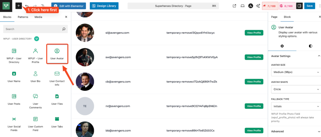
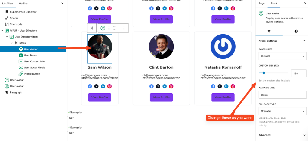
Purpose: Provide a visual identifier for each user in the directory or profile page. Improve recognition and engagement in team, vendor, or member listings. Maintain a consistent look using customizable size, shape, and fallback styles.
Key Settings
Avatar Size – Choose from preset sizes (e.g., Small, Medium, Large – default: 150px).
Avatar Shape – Display as a Circle or Square to match your layout style.
Fallback Type – Select what to display if no profile image is uploaded (Gravatar, then name Initials).
Note: If the user has set a profile photo using the WPUF Profile Photo Field (wpuf_profile_photo), it will always override the default WordPress avatar.
2: Username Block
The User Name block displays a user’s name in the profile layout or directory listing. It offers flexible formatting options so you can control how names appear across your user directories.
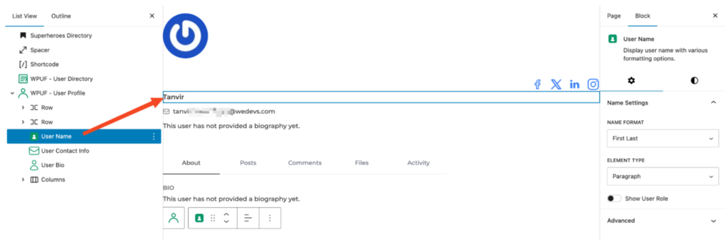
Purpose:
Clearly present the user’s identity using preferred formats. Customize the name display to match your site’s style and structure (e.g., formal, casual, or role-specific). You can also optionally show the user’s role for added context (e.g., Author, Vendor, Manager).
Key Settings:
- Name Format – Choose how the name is displayed:
- Display Name (default WordPress display name)
- Last, First
- First Last
- Nickname
- Username
- Display Name (default WordPress display name)
- Element Type – Define the HTML wrapper for the name:
- Paragraph (<p>) for standard text flow
- Span (<span>) for inline styling
- Paragraph (<p>) for standard text flow
- Show User Role – Toggle to display the user’s role beside or below their name.
3: User Bio Block
The User Bio block shows a short description or biography of the user, giving visitors quick insights into who they are, what they do, or their background.
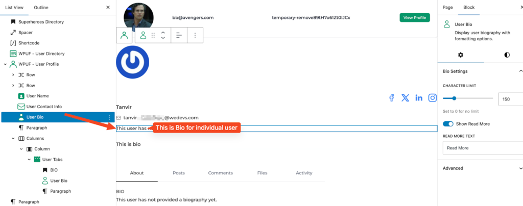
Purpose: Provide a brief personal or professional summary to add context and improve engagement.
Key Settings:
- Character Limit – Define the maximum number of characters to display (e.g., 150).
- Show Read More – Allow visitors to expand truncated bios.
- Read More Text – Customize the expansion link label (default: Read More).
4: User Contact Info Block
The User Contact Info block displays key details such as a user’s email or website, with flexible formatting for consistency and accessibility.
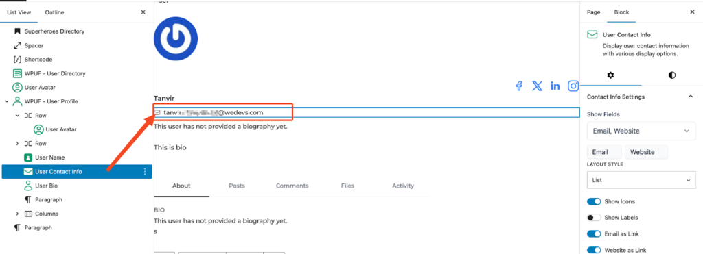
Purpose: Make it easy for visitors to connect directly with users through clean, clickable contact details.
Key Settings:
- Show Fields – Choose which details to display: All, Email only, or Website only.
- Layout Style – Inline (single row) or List (separate lines).
- Show Icons – Toggle icons for each contact type.
- Show Labels – Display labels like Email: or Website: before values.
- Email as Link – Make email clickable (mailto).
- Website as Link – Make website clickable (opens in a new tab by default).
5: Profile Button Block
The Profile Button block adds a customizable button linking directly to the user’s profile page. Best used within the User Profile block for quick navigation or editing.
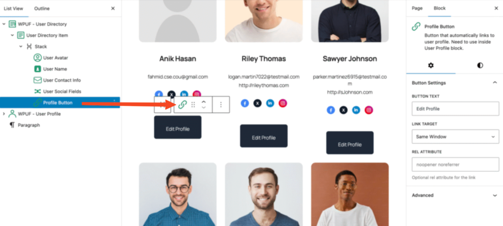
Purpose: Provide a clear call-to-action for profile access or editing, while maintaining consistent styling.
Key Settings:
- Button Text – Set the button label (e.g., View Profile, Edit Profile).
- Link Target – Open in the same window or new tab.
- Rel Attribute – Add optional attributes for SEO and security (e.g., noopener noreferrer).
6: User Tabs Block
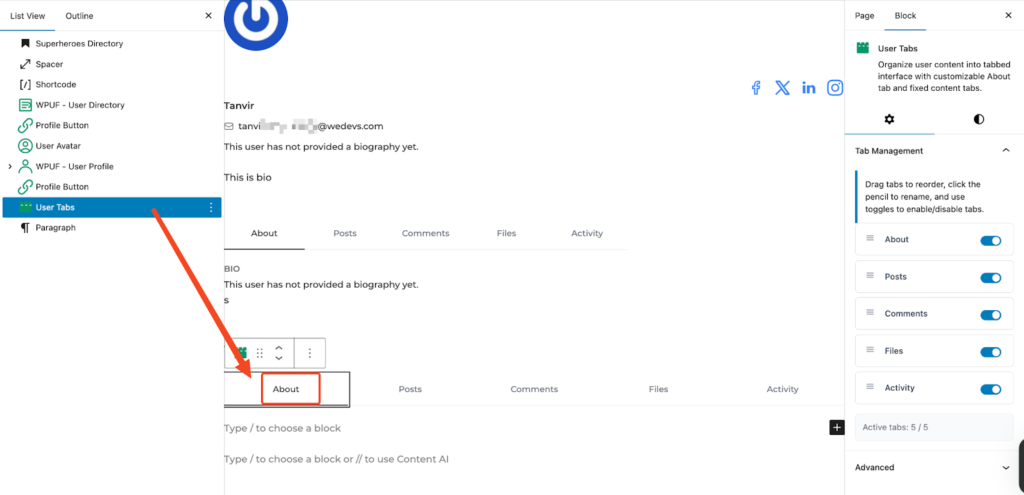
Purpose: Provide a structured layout for user information using a tabbed interface. This allows flexible tab arrangement, visibility control, and improved navigation across user profiles.
Key Settings
- Tab Management: Control the appearance and behavior of tabs.
- Drag tabs to reorder.
- Click the pencil icon to rename.
- Toggle tabs on or off to enable or disable them.
- Drag tabs to reorder.
- Active Tabs Indicator: Shows the number of currently active tabs (e.g., Active tabs: 5 / 5).
Use Case:
Organize user profile details into sections like “Overview,” “Activity,” “Posts,” or “Contact.” By customizing tab order and visibility, you can create a cleaner, more intuitive browsing experience for both members and visitors.
7: User Social Fields Block
Purpose: Display connected social profiles on user directories or individual profile pages. This helps improve engagement by giving visitors quick and easy access to users’ social links.
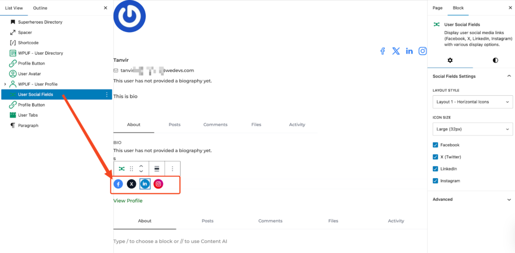
Key Settings
- Icon Size: Adjust the size of the social icons (e.g., Large = 32px).
- Platform Toggles: Enable or disable specific social platforms based on which profiles you’d like to display.
Use Case:
Highlight a user’s active social media platforms—such as Facebook, Twitter, LinkedIn, or Instagram—directly on their profile, making it easier for visitors to connect and engage outside of your site.
8: User Custom Field Block
Display any custom user meta field from WordPress or WPUF with flexible formatting and role-based visibility.
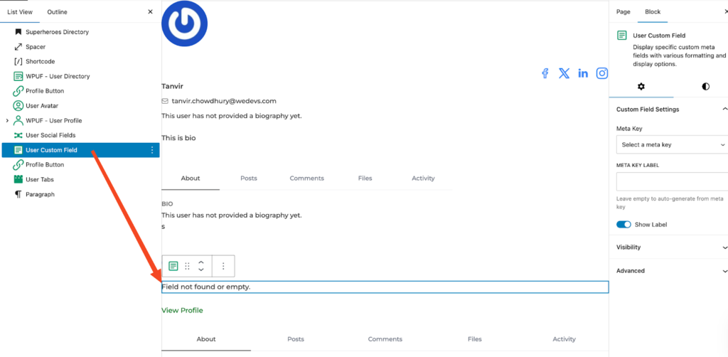
Key Settings
- Meta Key: Select the field you want to display.
- Label: Optionally add a custom label. If left blank, one will be generated automatically.
- Show Label: Choose whether to display the label or hide it.
- Profile User Role: Limit this block to appear only for specific user roles.
- Viewer Role: Decide who can view the field, with the option to include “Guest” users who are not logged in.
Use Case:
Display a custom field such as “Company Name” on vendor profiles, while ensuring it is only visible to logged-in users. This allows you to tailor profile information for specific roles while maintaining control over visibility.
9: User Files Block
Display file or image meta fields uploaded by users with flexible formatting and role-based visibility.
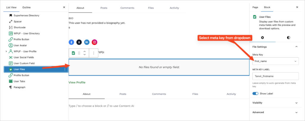
Key Settings
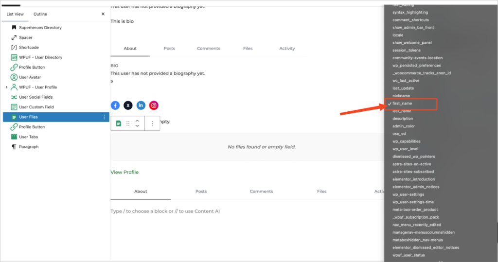
- Meta Key: Choose the file or image field you want to display.
- Label: Add a custom label for the field. If left blank, one will be auto-generated.
- Show Label: Enable or disable the display of the label.
- Profile User Role: Restrict this block so it only appears for selected user roles.
- Viewer Role: Define who can view the field, including the option to allow visibility for “Guest” users who are not logged in.
Use Case:
Display a user’s uploaded portfolio image or document within their profile. This is especially useful for showcasing work samples, resumes, or certifications, while giving you full control over which roles or even public visitors can access the content.
10: User Posts Block
Display posts authored by the user with flexible layout options and role-based visibility.
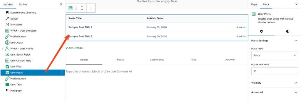
Key Settings
- Post Type: Select the type of content you want to display, such as standard blog posts or any custom post types.
- Posts Per Page: Specify how many posts should be shown per page.
- Profile User Role: Restrict this block to appear only for certain user roles.
- Viewer Role: Decide who can view the block. You may include “Guest” to make it visible to non-logged-in visitors as well.
Use Case:
Use this block to showcase the latest blog posts created by a user. It’s ideal for displaying posts directly on a user’s profile page, and you can control visibility, whether limited to logged-in members or open to public visitors.
11: User Directory Cover Photo Block
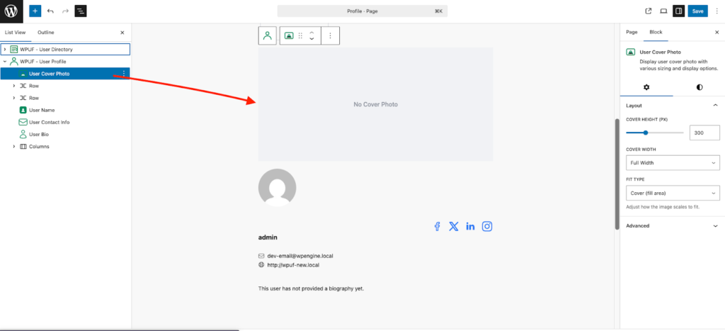
Now users can display a Cover Photo block under the WPUF – User Profile block to show cover photos. To do this, edit your profile page and, from the block section, drag and drop the User Cover Photo block.
Make sure to add the User Cover Photo block inside the WPUF – User Profile block. Then click the Save button.
After saving, go to the page preview and you will see the profile.
Then click the View Profile button. This will open the profile details page, where you will see the Cover Photo block.
Next, hover over the Cover Photo block and click the Upload button. A pop-up will appear, allowing you to click or drag and drop the cover photo you want to display.
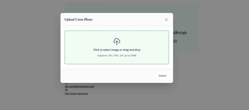
Then click the Uploaded button, and it will update your cover photo.
That’s it.
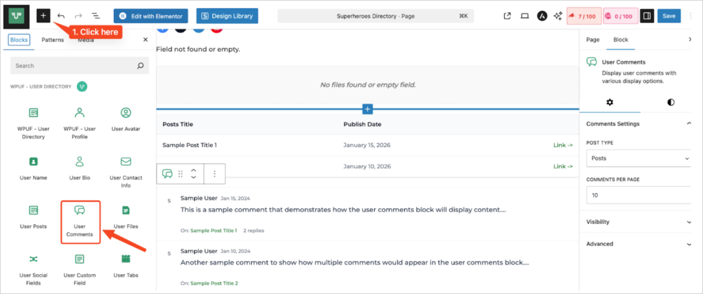
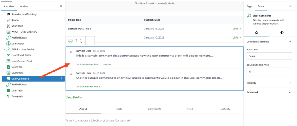
12: User Comments Block
Display comments made by the user with flexible layout options and role-based visibility.
Key Settings
- Comment Type: Select the type of comments you want to display. By default, this will show WordPress comments.
- Comments Per Page: Define the number of comments that should appear on each page.
- Profile User Role: Restrict this block to display only for specific user roles.
- Viewer Role: Decide who can view the block. You can include “Guest” to make it visible to non-logged-in visitors as well.
Use Case:
This block allows you to showcase all comments made by a specific user across your site. It can be placed on a user’s profile page or within a community member directory. With the role-based visibility settings, you can control which groups of users, such as members, admins, or guests, can view the comments.