


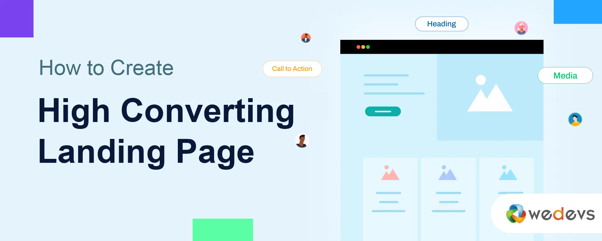
How to Create a High Converting Landing Page for Online Course
The global market size of the online education market was valued at around $38 billion in 2022, expected to reach $270 billion by 2031. So, if you can create valuable tutorials and educational content on important topics, you have a significant potential to make money by selling them online.
However, you must have a dedicated web page to successfully sell courses online. It will allow visitors to explore the courses you offer, review the topics covered, navigate to related posts, view available subscription plans, and proceed to the checkout page.
Moreover, it's important for credibility and to create trust in your brand. In this article, we'll cover a detailed guide on how to create a high converting landing page for online courses. Let's begin.
What Is an Online Course Landing Page?
An online course landing page is a specialized page designed specifically to promote and sell online educational courses. Its main objective is to generate leads, provide visitors with the information they need, and convert them into customers.
Other landing pages, like the homepage, usually display multiple products, links, and CTA sections. But an online course landing page focuses only on the courses it promotes and motivates people to buy them with a single call to action so people don't get distracted.
It covers clear-compelling titles and copies that instantly communicate to audiences the courses you offer, explaining the skills and knowledge students will gain upon completion.
How to Create a High Converting Landing Page for Online Course
A high quality landing sets the foundation for any successful marketing campaign. This is why it's important to create a landing with its high conversion ability in mind. So, how do you create a high-converting landing page? We'll explain this to you in the following write-up.
Step 01: Define Your Target Audience
Defining the target audience is the foundational step simultaneously for any successful web design and online course. This will help you tailor your messages, UX, promotional content, and online courses according to the needs and preferences of the people who will directly benefit.
There are several factors you can consider in audience research. The two most prominent of them are demographic and psychographic factors.
Demographic factors study audiences by age, gender, location, income level, education, and occupation. For example, if you’re offering a course on digital marketing, your target audience might consist of marketing professionals between 25 and 40 years old.
Psychographic factors cover the interests, values, and lifestyles of the audiences. If your courses are on fitness activities, your audiences should be those who are conscious about dieting, weight loss, daily exercise, etc. These audiences can be of any age.
Another interesting method is creating a buyer persona. This is a semi-fictional representation of the ideal audiences on market research and data. This can help you design and update high converting landing pages for online courses and execute marketing strategies.
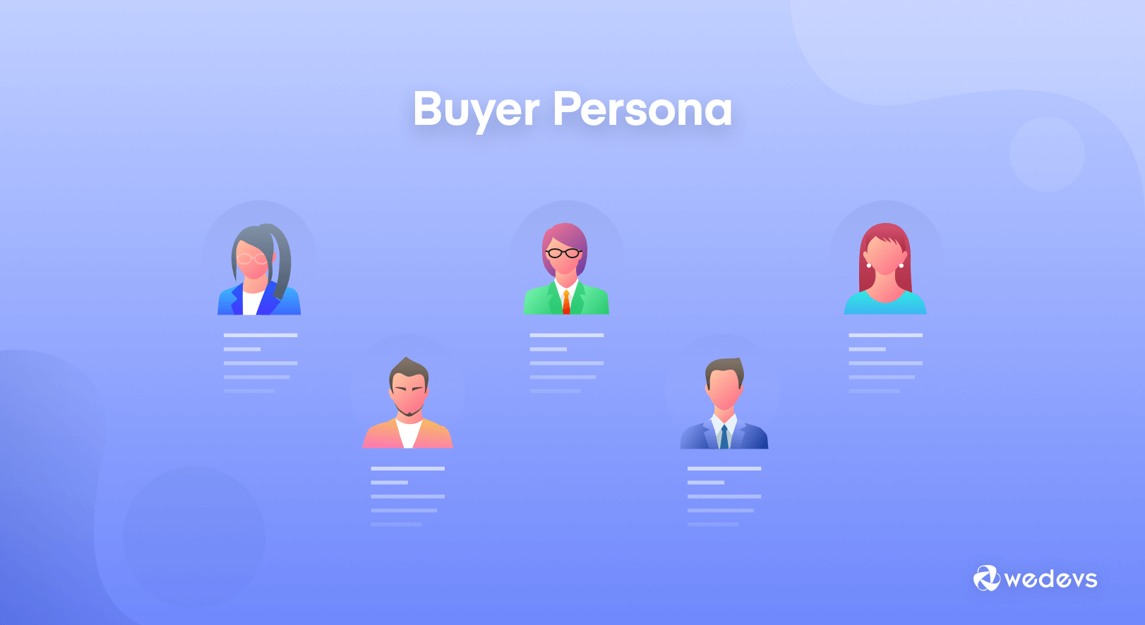
Here's a detailed guide on how to create a buyer persona. Once your research is done and target audiences are identified, you can create a compelling landing page by covering the following factors.
Step 02: Craft a Compelling Headline and Headings
A headline is simply the name/title of the respective landing page. A web page must have only one headline. This one is often marked as the H1 tag in HTML.
On the other hand, a heading is the name/title of a web section. As a web page may have numerous sections, you may add multiple headings. They help break up the long content so it becomes easy for visitors to read it. You can create a hierarchy between headings using tags from H1 to H6.
This means if a particular web section becomes quite long, you can break it up as well by adding multiple heading tags (H3 – H6) to create a hierarchy within its content.
However, you must maintain a logical structure while creating a hierarchy between the headline and headings. Otherwise, you will lag behind remarkably in terms of your SEO score.
Learn how to create a membership website to sell online courses.
Step 03: Use Engaging Visuals (Images and Videos)
At least 50% or more of any web page today consists of visual graphics. Because long and plain text content can create extreme levels of boredom in the reader's mind. This is why most people don't love to stay on those web pages for a long time, which cover only plain text content.
Moreover, the amount of message that an image, a ten-second gif, or a short video clip can convey to people can sometimes take hundreds of words to write.
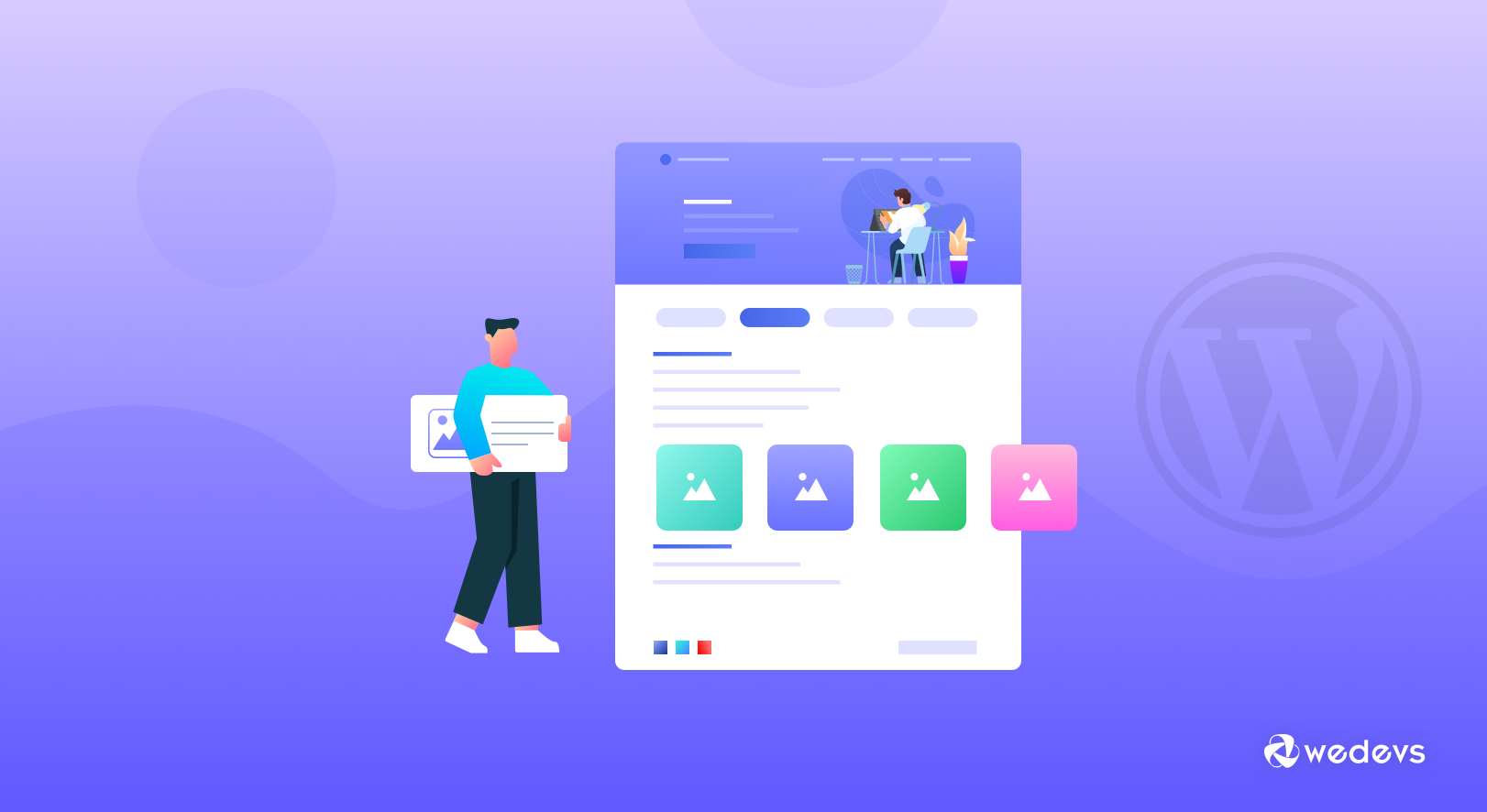
Therefore, by using enough relevant visual graphics, you can reduce the length of your web page, as it is possible to cover a lot of messages in a short space. This can also help you immensely in improving the user experience. For example, in this blog post, we've also used numerous visual images.
Step 04: Highlight Course Benefits and Outcomes
Highlighting the benefits and outcomes of your online courses on the landing page could be a powerful way to boost your sales. Because it can clearly communicate to people the value of your educational content, which is very important for driving conversions.
People often confuse features and benefits. Yet many people believe features are benefits, which is wrong. Features of an online course refer to the topics it covers. But the benefits explain how this course can help you master particular topics and give you real-world experience.
So, it's really important to highlight your course benefits and outcomes alongside the key features.
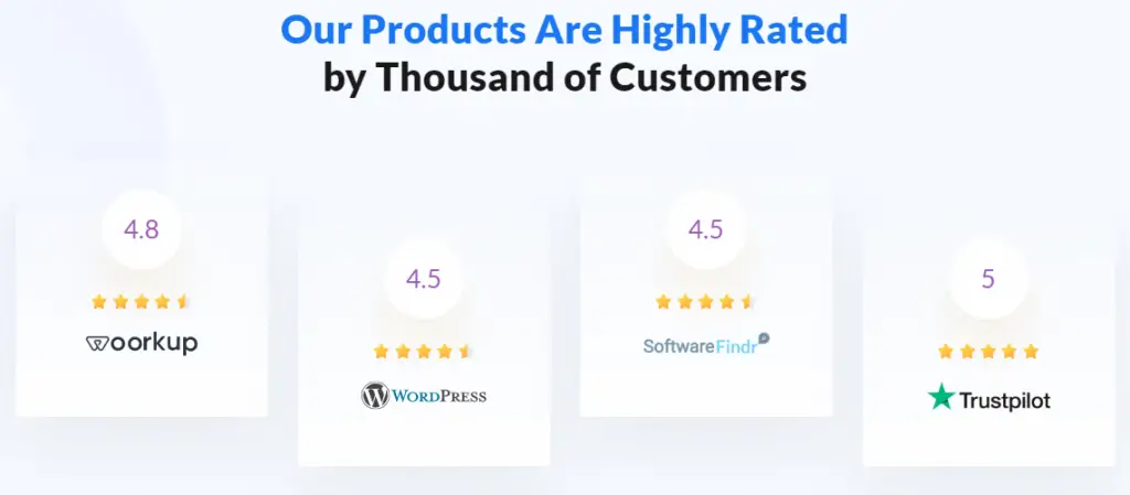
Step 05: Incorporate Social Proof (Testimonials and Ratings)
Incorporating social proof like testimonials and ratings is a proven tactic for growing credibility and trust in your potential students’ psychology. They act as a motivating and influential factor in decision-making. Today, over 70% of all online customers love to check reviews before buying a product.
When prospective customers see that someone has already bought the online course and is satisfied, it reassures them that they are making a wise decision. Alongside ratings and comments, you can display several short video clips in the slider covering their interview.
Note: Many are seen displaying fake testimonials on their landing page, which is totally wrong. Smart customers can identify it in a few minutes. This will create a really bad impression on your site. So, always look for authentic reviews, even if it takes time.
How to Get Quick Reviews in a Short Time?
You can initially offer access to some of your courses for free or for a minimal charge to a number of students. After they complete the course, you can take ratings, reviews, and interviews from them.
From here, you can generate the required social proof. As you'll offer courses for free or at a minimal cost, be sure that you'll get a huge number of applicants.
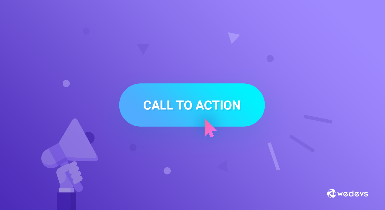
Step 06: Include a Clear Call to Action (CTA)
A call to action section is designed solely on web pages to convince potential students to take the actions you want. This could be buying your course, signing up for a newsletter, downloading a resource, etc. Without a CTA section, people will just read and explore your content but won’t convert.
A well-crafted CTA section can increase the selling potential by creating a sense of urgency among students. Below are the elements you must consider when creating your call to action (CTA) sections:
- Compelling copy
- Links to supporting information
- Catchy button(s)
- Minimal distractions
- Responsive design
- Strategic placement
It's important to test and update your CTA sections over time. Because the same CTA stylization may not give you the same result for an unconditional period. Keep doing A/B tests on different versions of the CTA to find which version works the best.
Explore some of the best CTA examples.
Step 07: Create a Detailed Pricing Table
Pricing tables can be regarded as the CTA section. So, if your landing page has a pricing table, you don't need to create an additional call to action section. Got it?
Pricing tables are important because they can provide students with a straightforward way to compare different pricing modules and decide on the one that best suits them. But for that you also need to design the pricing table in such a way that it does not leave any room for confusion.
Below are the elements you must consider when designing pricing tables for your online courses on the landing page:
- Clear plan names (Free, Basic, Standard, Advanced, etc.)
- Pricing plans (weekly, monthly, yearly, lifetime, etc.)
- Feature comparison (showcase features side-by-side in each plan)
- Consistency in using brand color and graphical elements
- Call to action button(s)
- Responsive design
- Refund and money-back guarantee period
Step 08: Optimize for Mobile Devices
Over 30% of all traffic to all websites today comes from mobile device users. But there are several website types where the amount of mobile traffic is very high, like eCommerce. This can also happen on your website as well. This is why you must optimize your site for mobile devices.
Take a look at the points to consider when optimizing your landing page for mobile devices:
- Responsive design (adapt to different screen sizes)
- Fast loading speed (optimize images and minimize codes)
- Simplify navigation
- Keep the text readable (minimum 16px)
- Avoid pop-ups and sidebars
- Hide less important sections
- Test across multiple devices
Step 09: Ensure Fast Loading Times
According to numerous statistics, over 50% of users move away to other websites if a landing page takes over 4-5 seconds to load. So, it's important to keep your web page lightweight, so it loads fast. There are numerous approaches you can implement to do this.
- Optimize Images: Compress images and video clips to reduce extra weight before uploading them to your landing page.
- Enable Lazy Loading: This loads images and videos only when they arrive at the viewpoint, reducing the initial loading time and improving the page performance.
- Leverage Browser Caching: By setting up caching, you can store a page in users' browsers so it loads quickly.
In addition, there are numerous things you can configure. But if you are a no-code user, you might get confused. It's better if you use a caching plugin because most of the caching plugins allow you to do all these configurations from a single dashboard.
Take a look at the best WordPress caching plugins.
Utilize WP User Frontend to Ease User Registration on Your Landing Page

WP User Frontend is a prominent WordPress plugin that allows you to create and manage forms for your website from the front end. With this plugin, you can simplify the registration process for students whenever they come to your landing page.
Remember, user registration is crucial on a course-selling landing page. Because it allows you to build a community of learners so they can access the course materials. Once users register, you can use their information to trailer your marketing campaigns perfectly.
Registered users provide the valuable information you need to track their progress, offer personalized support, and create an engaging learning environment. This keeps you informed and helps you make data-driven decisions. Learn how to create a registration form in the WP User Frontend.
Use Elementor and HappyAddons to Design Your Landing Page
Want to design web pages without coding? We have two great tools for you to realize this dream. Let's explore the tools below.
Elementor Page Builder Plugin
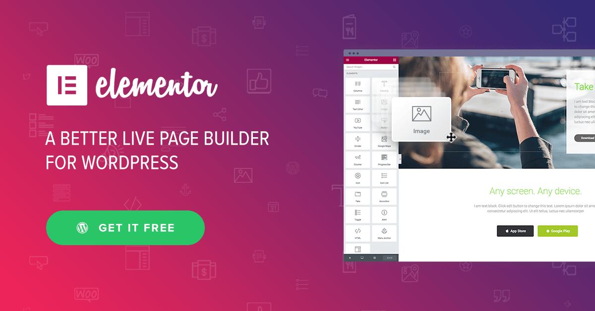
Elementor is the most popular drag-and-drop page builder plugin. This plugin is here to make you a professional web designer. Even if you are a no-code user and have no experience in web design, you can craft high-converting landing pages with this plugin just like a pro.
Elementor comes with 100+ powerful widgets. You can add countless advanced functionalities to your site using them. It also covers over a dozen features to improve user experience. Elementor has both free and premium versions.
HappyAddons Plugin
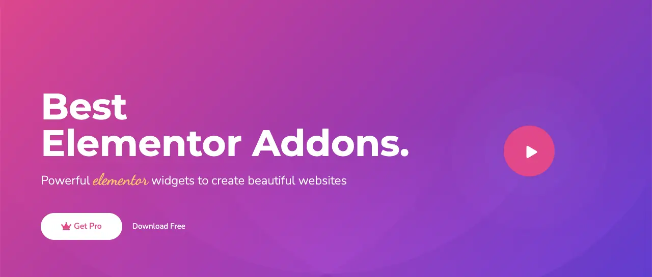
HappyAddons is a great addon for the Elementor plugin. Wherever Elementor lacks, you'll HappyAddons to overcome all the limitations. It includes 130+ widgets and nearly two dozen exciting widgets. When you have both the Elementor and HappyAddons plugins in hand, you can do remarkable web design.
Similarly to Elementor, this addon also has a free and premium version. If you don't want to use the premium version of either, you can use the free version of both to create great landing pages. If you are satisfied with both tools, you can always subscribe to their premium version.
Explore how to create a website with Elementor and HappyAddons. Get the plugins by clicking the links below.
Closing Words!
Creating a high converting landing page for online courses really requires a comprehensive set of strategic approaches. We have tried our best to cover them in the above write-up with proper details so you can understand them well. Hope you find them helpful for your strategy build-up.
In addition to the above discussion, there might be some points we have unintentionally missed to cover up. If you come across something like this, we request you to mention them in the comment box below so we can update them to make the content more helpful for general users.