Available User Field Elements
Elements of the User Field are the things available for the user to see on the front end.
To get to the available user field elements, at first navigate through:
WP-admin→User Frontend→Registration forms→Add forms and then follow the below steps.
After adding a new form for user, here is a view of the form editor section where you will be able to see and add all the available User Field Elements.
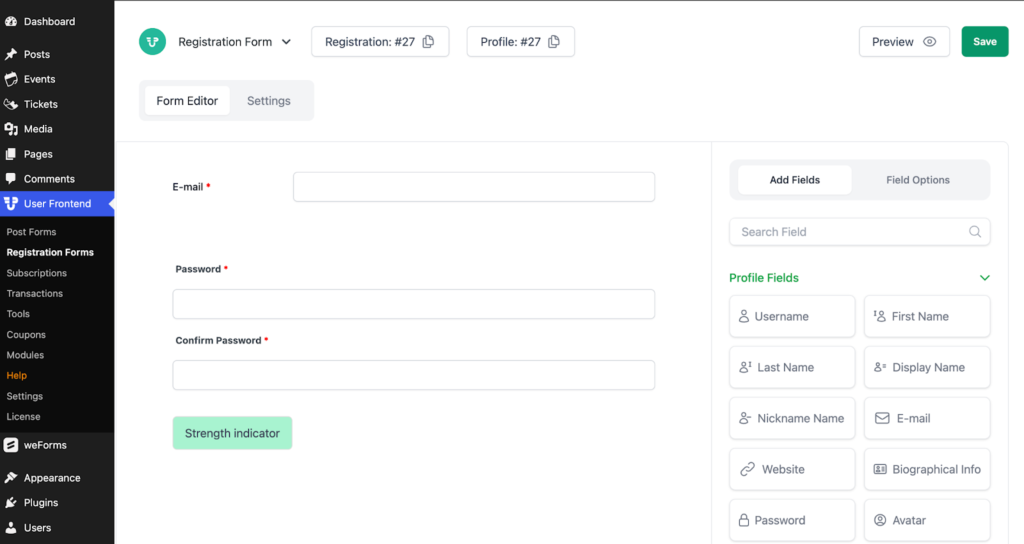
The above image shows a sample custom made registration form created with the available user field elements by adding fields from both Profile Field & Custom Fields section. A brief explanation of the above available User Field Elements and its field options are given below.
Username
Username field lets a user to input their username in the form.
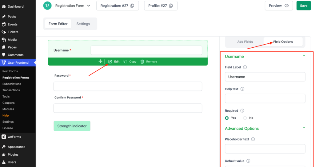
Description of Field Options of Username
- Field Label: This is the text that you will see on the form of the Username field. You can put any text here that helps to understand the use of this field.
- Help Text: You can put a help text for this field to display some specific message or instruction related to that field in order make the form user friendly.
- Required: This option allows you to make this field either required for submitting the form or optional.
Advanced Options of Username
- Placeholder Text: You can input the text for HTML5 placeholder attributes.
- Default Value: You can add default value for all the section of Username field.
- Size: Lets you to limit the size of Username field.
- CSS Class name: This option helps to include a CSS class for this field.
- Field Size: Allows you to choose three Field Size: Small, Medium & Large.
- Conditional Logic: Let's set the conditional logic of this field to Yes or No.
First Name
This field allows a user to input their first name.
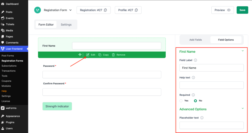
Description of Field Options of First Name
- Field Label: This is the text that you will see on the form of the First Name field. You can put any text here that helps to understand the use of this field.
- Help Text: You can put a help text for this field to display some specific message or instruction related to that field in order make the form user friendly.
- Required: This option allows you to make this field either required for submitting the form or optional.
Advanced Options of First Name
- Placeholder Text: You can input the text for HTML5 placeholder attributes.
- Default Value: You can add default value for all the section of First Name field.
- Size: Let's limit the size of the first name field.
- CSS Class name: This option helps to include a CSS class for this field.
- Field Size: Allows you to choose three Field Size: Small, Medium & Large.
- Conditional Logic: Let's set the conditional logic of this field to Yes or No.
Display Name
This field lets you to input the name that you want to be displayed.
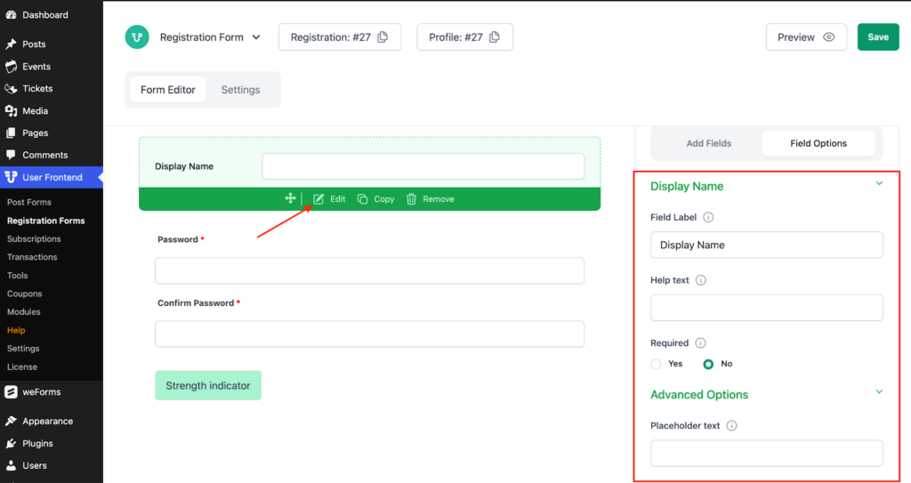
Description of Field Options of Display Name
- Field Label: This is the text that you will see on the form of the Display Name field. You can put any text here that helps to understand the use of this field.
- Help Text: You can put a help text for this field to display some specific message or instruction related to that field in order make the form user friendly.
- Required: This option allows you to make this field either required for submitting the form or optional.
Advanced Options of Display Name
- Placeholder Text: You can input the text for HTML5 placeholder attributes.
- Default Value: You can add default value for all the section of Display name field.
- Size: Lets you to limit the size of Display Name field.
- CSS Class name: This option helps to include a CSS class for this field.
- Field Size: Allows you to choose three Field Size: Small, Medium & Large.
- Conditional Logic: Let's set the conditional logic of this field to Yes or No.
This field lets the user to input their email address.
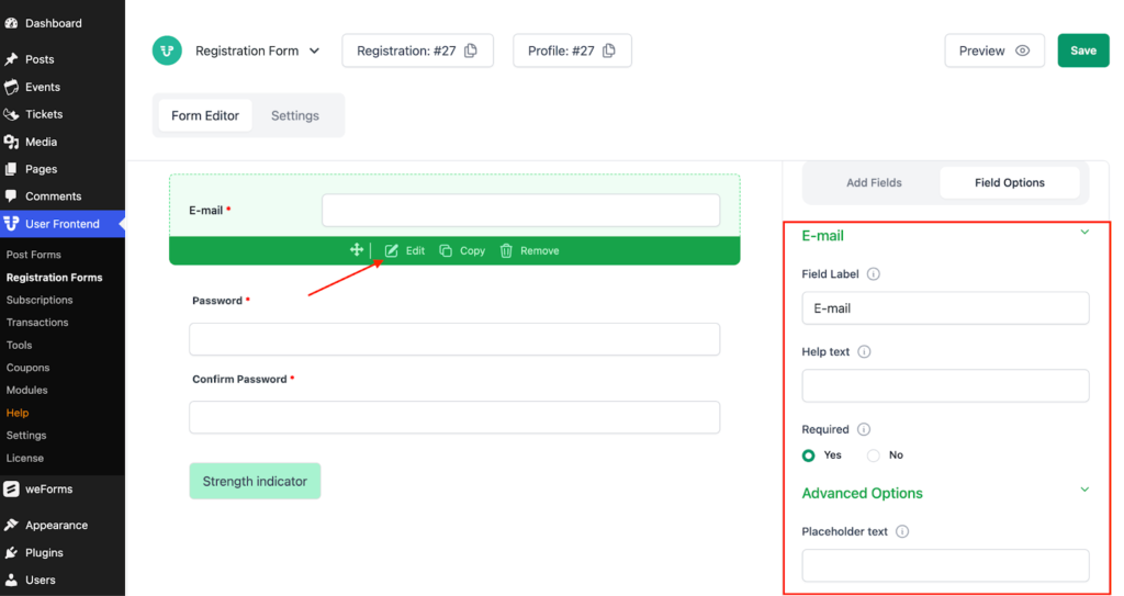
Description of Field Options of Email
- Field Label: This is the text that you will see on the form of the Email field. You can put any text here that helps to understand the use of this field.
- Help Text: You can put a help text for this field to display some specific message or instruction related to that field in order make the form user friendly.
- Required: This option allows you to make this field either required for submitting the form or optional.
Advanced Options of Email
- Placeholder Text: You can input the text for HTML5 placeholder attributes.
- Default Value: You can add default value for all the section of Email field.
- Size: Lets you to limit the size of Display Name field.
- CSS Class name: This option helps to include a CSS class for this field.
- Field Size: Allows you to choose three Field Size: Small, Medium & Large.
- Conditional Logic: Let's set the conditional logic of this field to Yes or No.
Date of Birth (DOB)
This is the field of inputting a user’s date of birth.
Description of Field Options of Date of Birth (DOB)
- Field Label: This is the text that you will see on the form of the DOB field. You can put any text here that helps to understand the use of this field.
- Help Text: You can put a help text for this field to display some specific message or instruction related to that field in order make the form user friendly.
- Required: This option allows you to make this field either required for submitting the form or optional.
Advanced Options of Date of Birth (DOB)
- Placeholder Text: You can input the text for HTML5 placeholder attributes.
- Default Value: You can add default value for all the section of DOB field.
- Size: Lets you to limit the size of Display Name field.
- CSS Class name: This option helps to include a CSS class for this field.
- Field Size: Allows you to choose three Field Size: Small, Medium & Large.
- Conditional Logic: Let's set the conditional logic of this field to Yes or No.
Website
This field enables the user to feed in their website address.
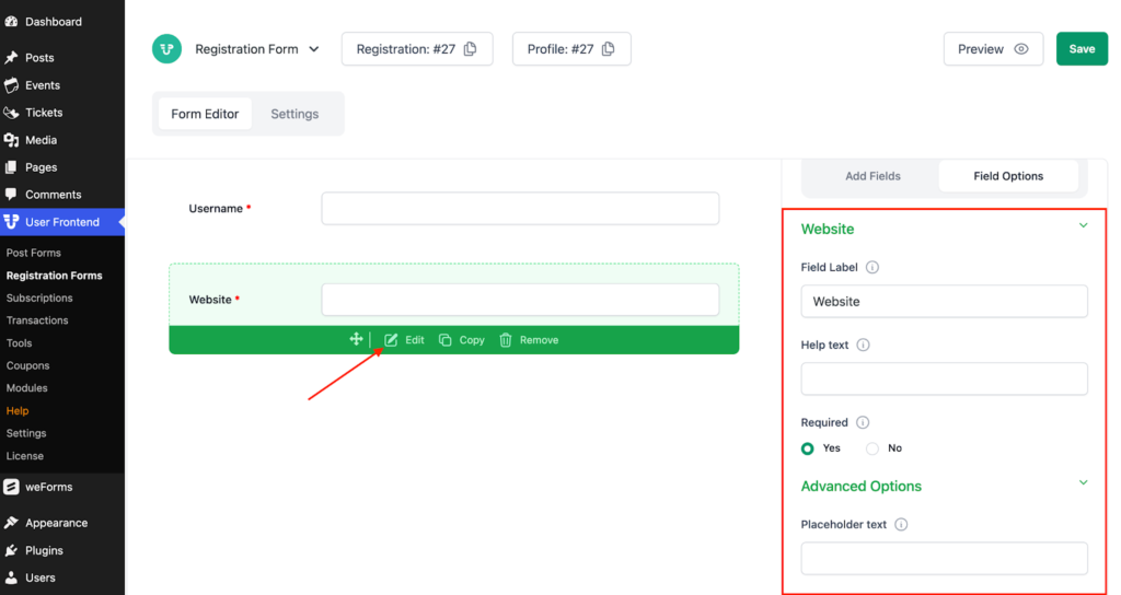
Description of Website field options
- Field Label: This is the text that you will see on the form of the Website field. You can put any text here that helps to understand the use of this field.
- Help Text: You can put a help text for this field to display some specific message or instruction related to that field in order make the form user friendly.
- Required: This option allows you to make this field either required for submitting the form or optional.
Advanced Options of Website
- Placeholder Text: You can input the text for HTML5 placeholder attributes.
- Default Value: You can add default value for all the section of Website field.
- Size: Lets you to limit the size of Display Name field.
- CSS Class name: This option helps to include a CSS class for this field.
- Field Size: Allows you to choose three Field Size: Small, Medium & Large.
- Conditional Logic: Let's set the conditional logic of this field to Yes or No.
Biographical info
This user field element allows the user to write a brief bio describing their own self.
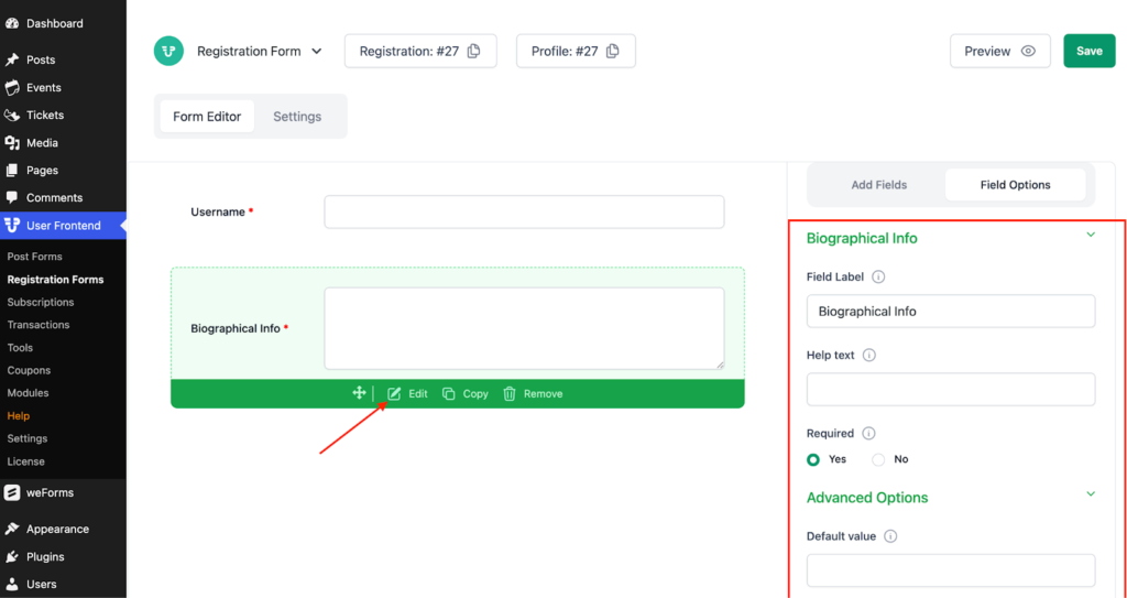
Description of Biographical Info field options
- Field Label: This is the text that you will see on the form of the Biographical Info field. You can put any text here that helps to understand the use of this field.
- Help Text: You can put a help text for this field to display some specific message or instruction related to that field to make the form user-friendly.
- Required: This option allows you to make this field either required for submitting the form or optional.
Advanced Options of Biographical Info
- Rows: Let's limit the number of rows in the textarea.
- Columns: Lets you to set the number of columns in Textarea.
- Placeholder Text: You can input the text for HTML5 placeholder attributes.
- Default Value: You can add default value for all the section of Biographical info field.
- Textarea: Lets you to select from three types of Textarea: Normal, Rich textarea & Teeny Rich textarea.
- Word Restriction: Restricts the number of words for the user in the field.
- CSS Class name: This option helps to include a CSS class for this field.
- Field Size: Allows you to choose three Field Size: Small, Medium & Large.
- Conditional Logic: Let's set the conditional logic of this field to Yes or No.
Password/Confirm Password
This field is used for inputting the login password of your ID and to confirm that password.
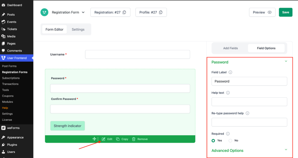
Description of Password/Confirm Password field options
- Field Label: This is the text that you will see on the form of the Password/Confirm Password field. You can put any text here that helps to understand the use of this field.
- Help Text: You can put a help text for this field to display some specific message or instruction related to that field to make the form user-friendly.
- Required: This option allows you to make this field either required for submitting the form or optional.
Advanced Options of Website
- Placeholder Text: You can input the text for HTML5 placeholder attributes.
- Default Value: You can add a default value for all sections of the website field.
- Size: It lets you limit the size of the Display Name field.
- CSS Class name: This option helps to include a CSS class for this field.
- Field Size: Allows you to choose three Field Size: Small, Medium & Large.
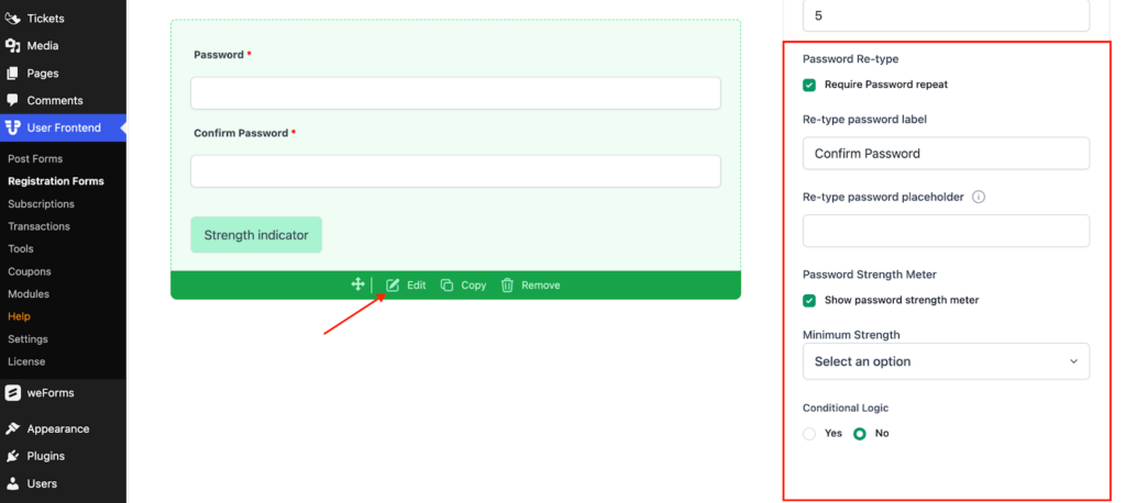
- Minimum Password Length: Limits the character of the password length for the user.
- Password Re-type: You can select password repeat option to add confirm password field
- Re-type password label: This lets you to change the label of Re-type password.
- Password Strength meter: Selecting this indicator lets you to determine the strength of your chosen password.
- Conditional Logic: Let's set the conditional logic of this field to Yes or No.
Avatar
This field allows you to upload images to the form
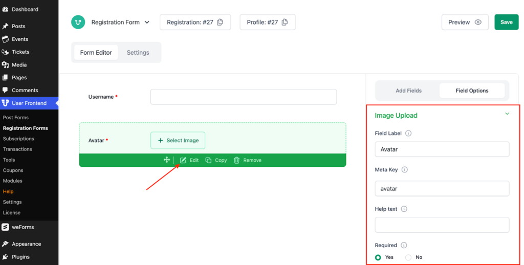
Description of Field Options of Avatar
- Field Label: This is the text that you will see in the form of the Avatar field. You can put any text here that helps to understand the use of this field.
- Help Text: You can put a help text for this field to display some specific message or instruction related to that field to make the form user-friendly.
- Required: This option allows you to make this field either required for submitting the form or optional.
Advanced Options of Date of Avatar
- Max. file Size: This limits the maximum size limit of your uploaded file/image in KB.
- Max files: This restricts the number of file/images to be uploaded.
- CSS Class name: This option helps to include a CSS class for this field.
- Field Size: Allows you to choose three Field Size: Small, Medium & Large.
- Conditional Logic: Let you set the conditional logic of this field to Yes or No.
Cover Photo
Users can also add a cover photo to their profile during registration. To do this, go to User Frontend → Registration Forms and create or edit a registration form.
Then, from the Profile Fields section on the right side, click to drag and drop the Cover Photo field.

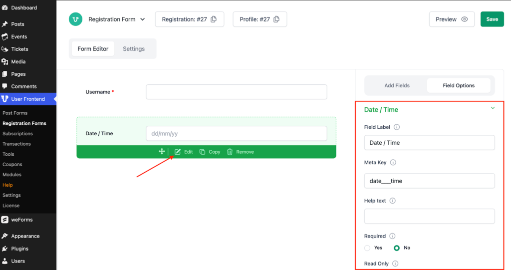
Time Field
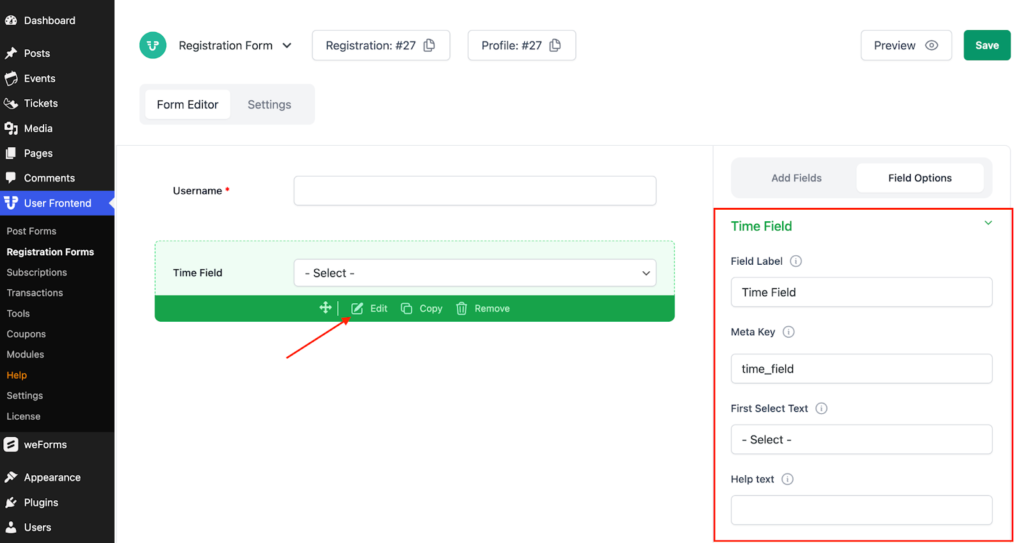
The time field allows respondents to select a time to create a schedule for any specific objective.
Description of Field Options of Time Field
- Field Label: This is the text that you will see in the form of the time field. You can type any text here that will help users understand the usage of this field.
- Meta Text: Lets you add additional information about this field.
- First Select Text: Leave this empty if you don’t want to show this field.
- Help Text: You can put a help text for this field to display some specific message or instruction related to the field to make this form user-friendly.
- Required: This option allows you to make this field either required for submitting the form or optional.
- Read-Only: Mark this field read-only if you want.
Advanced Options of Time Field
- CSS Class name: This option helps to include a CSS class for this field.
- Time Format: There are three-time formats; users can choose any one of them. The custom option is the technical PHP time format.
- Time Intervals: You can set minutes here to specify the time interval between each meeting or schedule.
- Conditional Logic: Conditional logic allows you to configure your form to show or hide fields, sections, and pages based on user selections.
Phone Field In User Profile
The Phone field allows users to input their phone numbers, which can be displayed in the User Profile block.
To use the Phone field, go to User Frontend → Registration Forms and edit your registration form. From the Profile Fields section on the right, drag and drop the Phone field into the form to display the user’s phone number in their profile.
Phone Field
The phone field lets users input their phone numbers.
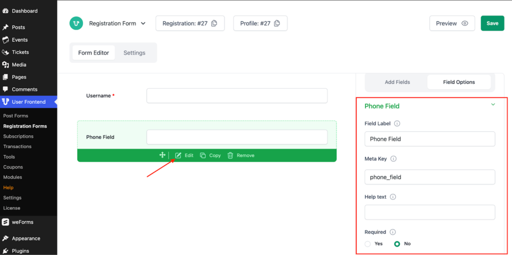
Description of Field Options of Phone Field
- Field Label: This is the text that you will see in the form of the time field. You can type any text here that will help users understand the usage of this field.
- Meta Key: Lets you add additional information about this field.
- Help Text: You can put a help text for this field to display some specific message or instruction related to the field to make this form user-friendly.
- Required: This option allows you to make this field either required for submitting the form or optional.
- Read-only: Mark this field read-only if you want.
Advanced Options of Phone Field
- Placeholder Text: You can input the text for HTML5 placeholder attributes.
- Default Value: You can add a default value for all the sections of the Phone field.
- Size: It lets you limit the size of the Phone field.
- Field Size: Allows you to choose three Field sizes: Small, Medium & Large.
- CSS Class name: This option helps to include a CSS class for this field.
- Show Country List: Enabling it you can select the specific country to type your phone number.
- Auto Placer: It automatically types the phone number saved in your cache.
- Default Country: Clicking on this dropdown option, you can select your preferred country.
- Conditional Logic: It lets you set the conditional logic of this field to Yes or No.
Embed
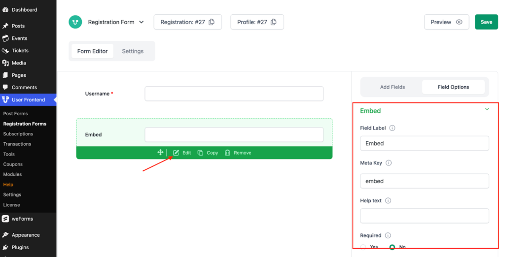
Description of Field Options of Embed
- Field Label: This is the text that you will see on the form of the Embed field. You can type any text here that will help users understand the usage of this field.
- Meta Key: Lets you add additional information about this field.
- Help Text: You can put a help text for this field to display some specific message or instruction related to the field to make this form user-friendly.
- Required: This option allows you to make this field either required for submitting the form or optional.
- Read-only: Mark this field read-only if you want.
- Preview Width: Specify your embed preview width in px.
- Preview Height: Specify your embed preview height in px.
Advanced Options of Embed Field
- Field Size: This allows you to choose three Field sizes: Small, Medium & Large.
- CSS Class name: This option helps to include a CSS class for this field.
- Conditional Logic: It lets you set the conditional logic of this field to Yes or No.
Column
This field allows users to arrange form fields column-wise for better appearance and user experience.
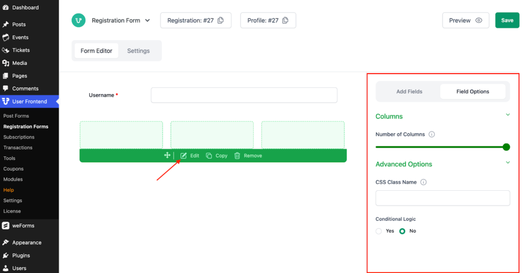
Description of Field Options of Column Field
- Number of Columns: From this option, you can modify the number of columns on your form.
- Space Between Columns: This section allows users to change space limits between columns.
Advanced Options of Column Field
- CSS Class Name: This option helps to include a CSS class for this field.
Section Break
Section break allows users to create separate sections for forms with a title and description.
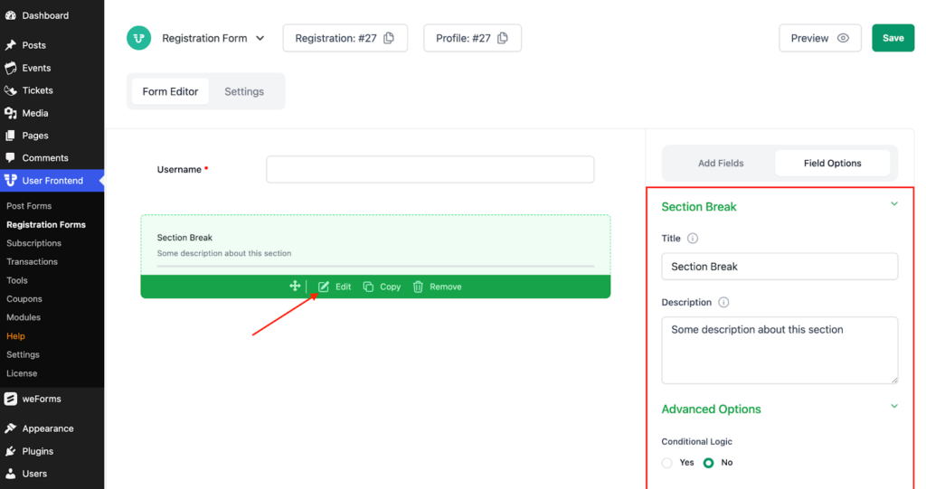
Description of Field Options of Section Break
- Title: You can use this field to give a name to your sections.
- Description: This field lets you describe your sections.
Advanced Options of Section Break
- Conditional Logic: It lets you set the conditional logic of this field to Yes or No.
HTML Section
You can create a separate HTML section for your user-facing website using this option.
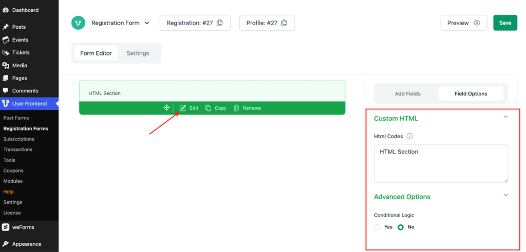
Description of Field Options in the HTML Section
- HTML Codes: You can type your HTML codes in this field.
Advanced Options in the HTML Section
- Conditional Logic: It lets you set the conditional logic of this field to Yes or No.
Shortcode
A shortcode allows you to add a complete, ready-made part to your form.
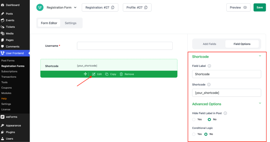
Description of Field Options of Shortcode
- Field Label: This is the text that you will see in the form of the shortcode. You can type any text here that will help users understand the usage of this field.
- Shortcode: Type your shortcode in this field.
Advanced Options of Shortcode
- Hide Field label in Post: Select yes if you want to hide the field level in single post.
- Condition Logic: It lets you set the conditional logic of this field to Yes or No.
Action Hook
Here, users can bind their functions and generate their dynamic content.
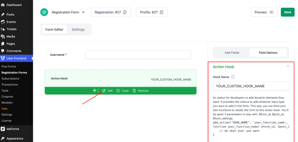
Hook Name: This is the text that you will see on the form of the Hook Name. You can type any text here that will help users understand the usage of this field.
Terms and Conditions
Terms and Conditions ask users if they agree to submit all the information they typed in the above fields.
Description of Field Options and Terms and Conditions
- Meta Key: Lets you add additional information about this field.
- Terms & Conditions: Type all your conditions in this field.
- Show checkbox: Using this option you can set whether to show the checkbox or not.
Advanced Options of Terms and Conditions
- Condition Logic: It lets you set the conditional logic of this field to Yes or No.
Ratings
The rating option asks readers and users how much they have loved the content.
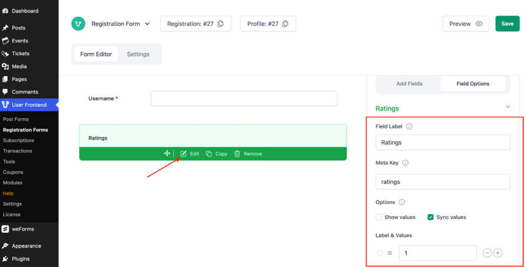
Description of Field Options of Ratings
- Field Label: This is the text that you will see in the form of the rating field. You can put any text here that will help users understand the use of this field.
- Meta Key: Lets you add additional information about this field.
- Options: Select any style the way you want to receive ratings.
- Help Text: You can put a help text for this field to display some specific message or instruction related to that field to make the form user-friendly.
- Required: This option allows you to make this field either required for submitting the form or optional.
- Read-Only: Mark this field read-only if you want.
Advanced Options of Ratings
- Field Size: This allows you to choose three Field sizes: Small, Medium & Large.
- CSS Class name: This option helps to include a CSS class for this field.
- Conditional Logic: This field lets you set the conditional logic of this field to Yes or No.
Math Captcha
Math Captcha asks users to solve a mathematical problem to prove they are humans
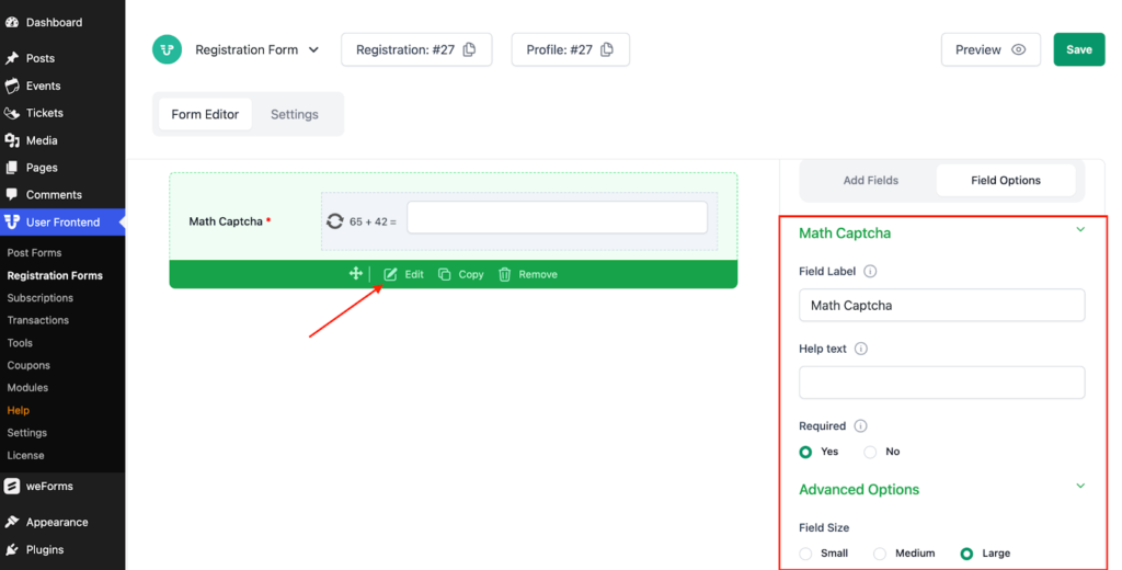
Description of Field Options of Math Captcha
- Math Captcha: This is the text that you will see on the form of the Math Captcha field. You can put any text here that helps users understand the use of this field.
- Help Text: You can put a help text for this field to display some specific message or instruction related to that field to make the form user-friendly.
- Required: This option allows you to make this field either required for submitting the form or optional.
Advanced Options of Math Captcha
- Field Size: This allows you to choose three Field sizes: Small, Medium & Large.
- CSS Class name: This option helps to include a CSS class for this field.
- Conditional Logic: This field lets you set the conditional logic of this field to Yes or No.
For further queries, contact our support team.